⚙️ Accessing the Landing Page Builder
- Go to Software Settings.
- Click Landing Page Builder.
You’ll see:
- A settings sidebar (left side)
- A live preview of your landing page (right side)
All settings are located in the settings sidebar so you can focus on the preview without distractions.
🧭 Understanding the Sidebar Sections
The sidebar is organized into collapsible sections:
- Page Settings (colors, fonts, general settings)
- Navigation (menu links and visibility)
- Hero Banner (top section of your page)
- Action Bar (quick access to key actions)
- Footer & Links (contact info and social links)
- Content Blocks (main page content)
Click any section to expand and edit its settings.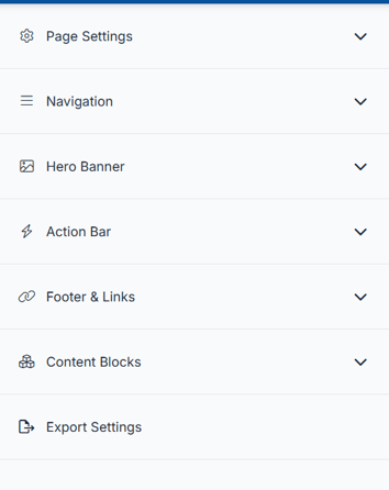
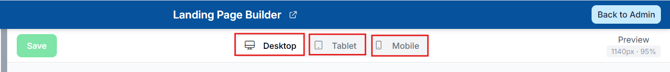
🖥️ Previewing Your Page on Different Devices
You can preview how your page looks on different screen sizes.
- Use the device icons at the top of the preview:
- Desktop
- Tablet
- Mobile
- Click an icon to switch views.
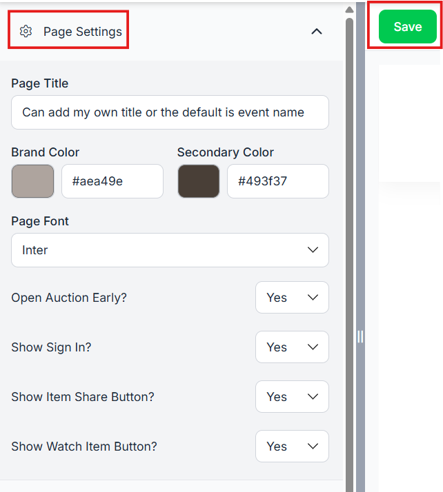
🎨 Updating Page Settings
In the Page Settings section, you can customize your overall design:
- Add a Page Title
- If no page title is added the default will be the event name listed under Software Settings>Event Settings> Event Information> Event Name
- Primary Color (main brand color)
- You can enter a color option or you can click on the color block listed and use a color picker.
- Secondary Color (button colors)
- You can enter a color option or you can click on the color block listed and use a color picker.
- Font Selection
- There are 9 different fonts to choose from: Inter, Montserrat, Source Sans 3, Libre Baskerville, Merriweather, Playfair Display, Lobster, Overlock, & Righteous
- Open Auction Early?
- Important: This will make your auction live before the scheduled start date. Be sure you’re ready for bidding before turning this on.
- Show Sign In?
- This enables the Sign In option, allowing donors to log into the auction and place bids.
- Show Item Share Button?
- Setting this to Yes: Allows your donors to share items with those who are not at your event with the item share links.
- Show Watch Item Button?
- This allows your donors to heart an item and add it to their watched section in the auction listed under the All Items tab with the drop down arrow.
📝Use this section to customize your auction’s branding, visibility, and features. Review each setting carefully to ensure your site looks the way you want and functions smoothly for your donors.
⚠️Before leaving the page, be sure to click the Save button at the top of the navigation bar. If you navigate away without saving, your changes will be lost and the page will revert to the last saved version.
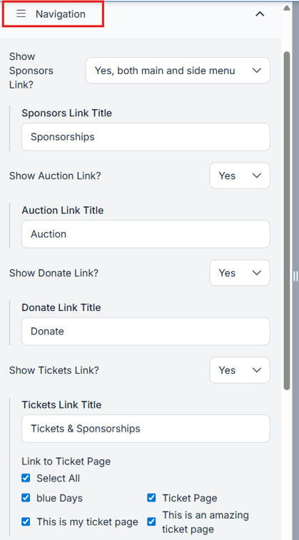
🧭 Customizing Navigation
You can control what appears in your event menu and navigation bar.
Options include:
- Show or hide standard links
- Add up to 3 custom action links
- Edit link titles (up to 25 characters)
Sponsors Link Options:
- Show in Main & Side Menu
- Show in Side Menu Only
- Hide Completely
- Be sure to add a title in the Sponsor Link Title field. This is what will display in the navigation at the top of the page on desktop, or in the menu depending on your layout settings.
The Sponsors link is set to Side Menu Only by default but can be changed at any time.
Show Auction Link? if set to yes this will display in the top navigation area along with the menu. If set to no it does not display at all.
- Add a title if set to yes
Show Donate Link? if set to yes this will display in the top navigation area along with the menu. If set to no it does not display at all.
- Add a title if set to yes
Show Tickets Link? if set to yes this will display in the top navigation area along with the menu. If set to no it does not display at all.
- Tickets Link Title: If you have more than one ticket page, you can choose which ones to display in the navigation and menu by selecting as many as you’d like.
🖼️ Editing the Hero Banner
The Hero Banner is the top section of your landing page.
- Choose from 6 layout options.
- Hero 1 – Logo at the top, background under content
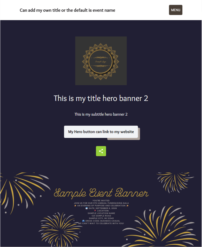
Hero 2 – Text left, image right
Hero 3 – Stacked logo, title, and subtitle
Hero 4 – Text box on left, background on right
Hero 5 – Full background with layered content
Hero 6 - Full background without a black overlay. This one uses your full color option in the image - To view the different layouts click here
- Hero 1 – Logo at the top, background under content
- Add a Title or leave blank based on your preferences.
- Add a Subtitle or leave blank based on your preferences.
- Upload a logo and/or background image.
- To view recommended image sizes click here
- Add a background color to help eliminate white space and create a more polished, cohesive look for your page.
- Click on the color box to open the color picker. From there, you can choose a color, slide to adjust it, use the dropper to pick a color from your screen, or enter a specific RGB or hex code if you have one
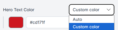
- Hero Text Color
- A hero text color lets you make the big headline on your page stand out and stay readable against whatever background is behind it.
- Leaving it as a custom color will make sure your page is ADA compliant. You want to make sure the color you choose is easy for those who are visually impaired can view it.
- Show Hero Button? Setting this to yes allows you to add a Button title and link it to an external URL. This is useful if you want to highlight or direct donors to a specific website.
- Show Social Media Share Buttons? Setting this to yes will display sharing options such as Facebook, X, Email, and a share link, giving donors multiple ways to share your event landing page.
If you prefer to keep your landing page private, it’s best to set this option to No. - In this screenshot all options above are set to yes and using hero banner 2
- Added a background color that matched the color scheme.
10. No background color added: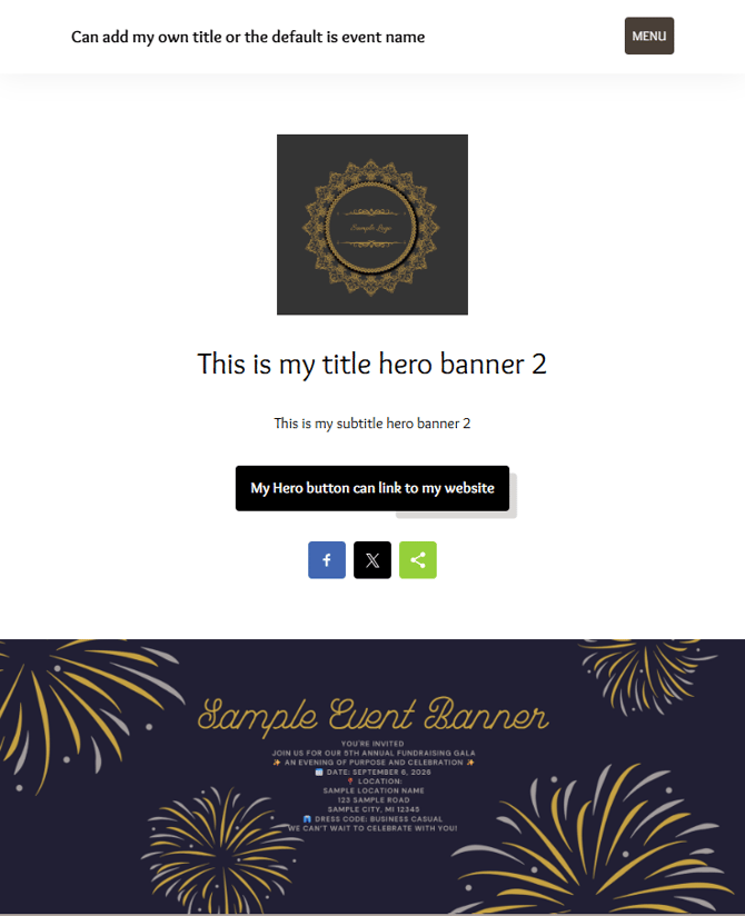
If using a background color instead of an image, choose a color that contrasts well with your text for better readability and ADA compliance.
⚠️Before leaving the page, be sure to click the Save button at the top of the navigation bar. If you navigate away without saving, your changes will be lost and the page will revert to the last saved version.
➕ Adding Action Bar Links
Add up to three buttons right below the Hero Banner to highlight key event actions.
- Under the Action Bar section
-
Click +Add Action Bar link
-
Choose a Type (examples: Buy Tickets, Make a Donation, Donate Item)
-
Add an Icon (not required)
-
Add a Title (Required)
-
Use Edit (gear icon) to edit the action bar
-
Use Delete (trash can) to remove the action bar
-
Use the arrows to change the order the action bar is to display
⚠️Before leaving the page, be sure to click the Save button at the top of the navigation bar. If you navigate away without saving, your changes will be lost and the page will revert to the last saved version.
👣 Footer & Links
In the Footer & Links section, you can add:
- Support email address
- If you’d like participants to be able to reach out with questions, add a contact person in this section. Their information will appear at the bottom of the landing page.
- If you’d like participants to be able to reach out with questions, add a contact person in this section. Their information will appear at the bottom of the landing page.
- Social media links (Facebook URL, Twitter URL, Instagram URL)
- Google Analytics ID
🧱 Adding and Managing Content Blocks
Content blocks control the main sections of your page.
To Add a Content Block:
- In the Content Blocks section, click + Add Content Block.
- Select the type of block you want.
- Appeal Display
- This allows you to feature a specific cause or fundraising goal and encourage guests to donate directly
- Option to show block
- Select a Background Color
- Show Title
- Show Header
- Title is required but can be hidden from the landing page (the title will still display in the menu as a link to the content block)
- Header is not required but will display as larger text than the title
- Content can be added regarding the appeal
- Can align left or center
- Select the item for the appeal board to display
- Auction Items
- This allows guests to easily browse and preview items before or during the event
- Option to show block
- Select a Background Color
- Show Title
- Show Header
- Title is required but can be hidden from the landing page. The title will still display in the menu as a link to the content block
- Header is not required but will display as larger text than the Title
- Can Align left or center
- Cumulative Total Bar
- Shows real-time total of bids and donations
- Option to show block
- Select a Background Color
- Show Title
- Show Header
- Title is required but can be hidden from the landing page (the title will still display in the menu as a link to the content block)
- Header is not required but will display as larger text than the title
- Content block to add information regarding the bars
- Bar layout Style
- Full Width
- Grid
- Click + Add Bar
-
New Bar field displays
-
Add Name for the bar
- Bar Color
- Goal
- Buffer
- Bar Style
- Bar
-
Circle
- Type
- All
- All Donation items
- All Live Items
- All Silent Items
- All Quantity Items
- All Blind Items
- Select a specific Category
- Select certain items
- More than one bar can be added
-
- Appeal Display
-
- Donate an Item
- Adds a form that allows supporters to submit items they would like to contribute to your event’s auction
- Option to show block
- Select a Background Color
- Show Title
- Show Header
- Title is required but can be hidden from the landing page (the title will still display in the menu as a link to the content block)
- Header is not required but will display as larger text than the Title.
Content block to add information regarding the bars - Alignment: The title and header will follow the alignment setting (Left/Center), but the description and button are styled separately to create visual space between them
- Featured Items
- This allows you to showcase up to 4 items you want to draw extra attention to, such as high-value items, popular packages, or items you want to promote before or during the event
- Option to show block
- Select a Background Color
- Show Title
- Show Header
- Title is required but can be hidden from the landing page. The title will still display in the menu as a link to the content block
- Header is not required but will display as larger text than the Title.
Content block to add information regarding the bars - Content can be added regarding the items
- Can Align left or center
- Select which 4 items you want to display
- Free-form
- This gives you flexibility to share anything you’d like with your guests, such as event details, instructions, schedules, or special messages
- Option to show block
- Select a Background Color
- Show Title
- Show Header
- Title is required but can be hidden from the landing page (the title will still display in the menu as a link to the content block)
- Header is not required but will display as larger text than the title
content block to add information regarding the bars - Content can be added using AuctionGPT or your own content
- Can Align left or center
- Donate an Item
💡 a good rule of thumb is to keep images in the Free Form content area no wider than 1200px. That way they'll look sharp and crisp without slowing your page down.
- Image/Text Split
- This is a great way to combine visuals with important information in a clean, easy-to-read layout
- Option to show block
- Select a Background Color
- Show Title
- Show Header
- Title is required but can be hidden from the landing page (the title will still display in the menu as a link to the content block)
- Header is not required but will display as larger text than the title
Content block to add information regarding the bars - Content can be added to give potential donors more information
- Can Align left or center
- Image position can be bottom, left, Right, or top in this section
- Image Type can be either full/edge to edge , Boxed, or add an image gallery
- Using the image gallery you can enable auto scroll and how many seconds to display before auto scroll begins
- Add images by clicking on Choose Files button
- After adding images you can move them up or down to place them in the order you would like them to display
ℹ️What size images should I use in the Image/Text Split block
This is the block where your text sits next to (or above/below) a photo.
If your image is set to Full/Edge-to-Edge and sits beside your text, aim for 1200 × 900px. If it sits above or below your text, go wider: 1920 × 800px.
If your image is set to Boxed (meaning it has a little breathing room around it), 800 × 600px (4:3 ratio) is a good safe size or 1000 × 750px works well. .
If you're using a Gallery (multiple images that scroll), aim for 1080 × 780px for each photo and try to keep them all the same size so they look consistent.
-
-
- This helps create excitement and friendly competition by showing who is most engaged in the event
- Option to show block
- Select a Background Color
- Show Title
- Show Header
- Title is required but can be hidden from the landing page (the title will still display in the menu as a link to the content block)
- Header is not required but will display as larger text than the title content block to add information regarding the bars
- Content can be added to give potential donors more information
- Can Align left or center
- Make a Donation
- This gives supporters an easy way to contribute to your cause at any time, even if they are not bidding or purchasing tickets
- Option to show block
- Select a Background Color
- Show Title
- Show Header
- Title is required but can be hidden from the landing page (the title will still display in the menu as a link to the content block)
- Header is not required but will display as larger text than the title content block to add information regarding the bars
- Content can be added to give potential donors more information
- Can Align left or center
- Sort by:
- Item Number
- Overall Amount Raised
- By Category Amount Raised
- Item Selection
- Options to select items
- One or more items can be selected
- Options to select All Active Donation Items
- Options to select items
-
-
- Sponsors
- This allows you to recognize and thank sponsors while also showcasing their support to your guests.
- Start a Peer to Peer Campaign
- This lets individuals or teams raise money on your behalf by sharing their personal campaign with friends and family.
- After saving the content block, an Embed Code field will appear. This allows you to display the donation items from that content block on your own website by embedding the code.
- Sponsors
💡General tips for any image:
-
Keep file sizes reasonable, if your photo is several MB, try compressing it at a site like tinypng.com before uploading
-
JPG works great for photos, PNG is better for logos or graphics with text
To Reorder Content Blocks:
- Drag and drop blocks in the sidebar by hovering over the six dots
 on the left side of each block.
or - Use the up/down arrows

Additional Options:
 Eye icon → Show or hide the block from the public landing page until you’re ready for it to be visible.
 Delete icon → Remove the block
 Gear icon → Edit content Block
Only turn on blocks you plan to use, this keeps your landing page clean and easy to navigate.
⚠️Before leaving the page, be sure to click the Save button at the top of the navigation bar. If you navigate away without saving, your changes will be lost and the page will revert to the last saved version.
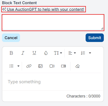
✏️ Editing Content
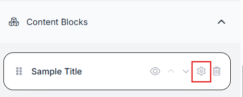
- Edit content directly within each block using the gear icon
- Use the AuctionGPT icon for help writing content
✅ Summary
The Landing Page Builder gives you full control over your event’s look and feel. With real-time previews, flexible content blocks, and simple navigation tools, you can quickly build a polished and engaging page for your guests, no technical experience require